

Logo Refresh
Te Pua Waananga Ki Te Ao is the Faculty of Māori and Indigenous Studies at the University of Waikato. Having used the same visual identity for 30 years, they faced a modern challenge: the original logo was too intricate to cleanly print on merchandise like drink bottles.
They commissioned me to refresh the brand assets. The brief was to simplify the design for modern digital and print applications while strictly preserving its original colors, core elements, and cultural essence.
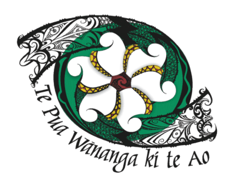
I began the refinement process by removing the intricate background mesh pattern behind the central flower element.
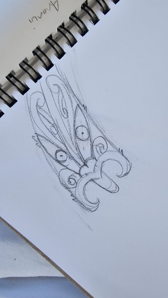
Through iterative sketching, I explored ways to streamline the facial features and thickened the overall linework to ensure clean, high-quality printing production.
While minimizing complexity, I was careful to preserve every meaningful cultural element and the core essence of the original brand. This resulted in three distinct concepts, showcased below.
The client selected the third concept. Along with the primary full-color logo, I delivered a monochromatic variation to ensure versatility across all mediums.
To fully support their updated visual identity, I also designed a suite of collateral, including email signatures, business cards, letterheads, and a custom PowerPoint template.



Email Signature

Business Card Full Colour
Business Card Mono
Business Card Mono Inverse
Letterhead
Powerpoint Presentation Template
Logo Refresh
Te Pua Waananga Ki Te Ao is the Faculty of Māori and Indigenous Studies at the University of Waikato. Having used the same visual identity for 30 years, they faced a modern challenge: the original logo was too intricate to cleanly print on merchandise like drink bottles.
They commissioned me to refresh the brand assets. The brief was to simplify the design for modern digital and print applications while strictly preserving its original colors, core elements, and cultural essence.
I began the refinement process by removing the intricate background mesh pattern behind the central flower element.
Through iterative sketching, I explored ways to streamline the facial features and thickened the overall linework to ensure clean, high-quality printing production.
While minimizing complexity, I was careful to preserve every meaningful cultural element and the core essence of the original brand. This resulted in three distinct concepts, showcased below.
The client selected the third concept. Along with the primary full-color logo, I delivered a monochromatic variation to ensure versatility across all mediums.
To fully support their updated visual identity, I also designed a suite of collateral, including email signatures, business cards, letterheads, and a custom PowerPoint template.
Email Signature